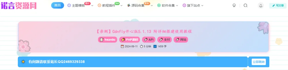
子比美化 – 文章页顶部添加文章内容信息admin4天前更新关注私信0507 给子比主题文章页面的顶部加一个美化样式,看上去比较的二次元,喜欢的自行部署吧! 效果图 代码 本文隐藏内容 去主题文件的single.php文件中找到第31行的位置,然后粘贴下面的代码 <?php // 获取文章分类或标签 $categories = get_the_category(); $tags = get_the_tags(); // 计算字数和阅读耗时 $word_count = str_word_count(strip_tags(get_the_content())); $reading_time = ceil($word_count / 300); // 假设阅读速度为每分钟300字 // 格式化发布日期 $publish_date = get_the_date('Y-m-d'); ?> <div class="tuc-2ea177b2-3fcc0a-0 article-header tuc-2ea177b2-3fcc0a-0" style="background: var(--article-bg, linear-gradient(135deg, #ffd1dc, #c1e1ff)); padding: 15px; border-radius: 16px; border: 3px solid var(--article-border, transparent); margin: 20px 0; font-size: 14px; color: var(--article-text, #333); position: relative; overflow: hidden; box-shadow: 0 4px 12px var(--article-shadow, rgba(255, 126, 185, 0.3)); transition: transform 0.3s ease, box-shadow 0.3s ease; width: 100%; max-width: 100%; text-align: center;"> <!-- 二次元装饰图标 --> <span style="position: absolute; top: -20px; right: -20px; font-size: 60px; color: var(--article-icon, #ff7eb9); opacity: 0.2; transform: rotate(30deg);">🎀</span> <span style="position: absolute; bottom: -20px; left: -20px; font-size: 60px; color: var(--article-icon, #ff7eb9); opacity: 0.2; transform: rotate(-30deg);">🌸</span> <!-- 动态悬浮效果 --> <div class="tuc-2ea177b2-3fcc0a-0 particle-effect tuc-2ea177b2-3fcc0a-0" style="position: absolute; top: 0; left: 0; width: 100%; height: 100%; background: radial-gradient(circle, var(--article-particle, rgba(255, 126, 185, 0.2)) 10%, transparent 10.01%); background-size: 20px 20px; animation: move 3s infinite linear;"></div> <!-- 文章信息内容 --> <div style="position: relative; z-index: 2;"> <h1 class="tuc-2ea177b2-3fcc0a-0 article-title tuc-2ea177b2-3fcc0a-0" style="font-size: 20px; color: var(--article-title, #ff7eb9); margin-bottom: 10px; font-family: 'Comic Sans MS', cursive, sans-serif;"> <?php the_title(); ?> </h1> <!-- 作者、分类、标签 --> <div class="tuc-2ea177b2-3fcc0a-0 article-meta-buttons tuc-2ea177b2-3fcc0a-0" style="display: flex; justify-content: center; align-items: center; gap: 10px; flex-wrap: wrap; margin-bottom: 10px;"> <!-- 作者 --> <span style="display: flex; align-items: center; gap: 4px;"> <a href="<?php echo get_author_posts_url(get_the_author_meta('ID')); ?>" style="background: var(--article-button-bg, #ff7eb9); color: var(--article-button-text, #fff); padding: 4px 8px; border-radius: 12px; text-decoration: none; font-weight: bold;">📝 <?php the_author(); ?></a> </span> <!-- 分类 --> <?php if (!empty($categories)) : ?> <span style="display: flex; align-items: center; gap: 4px;"> <a href="<?php echo get_category_link($categories[0]->term_id); ?>" style="background: var(--article-button-bg, #ff7eb9); color: var(--article-button-text, #fff); padding: 4px 8px; border-radius: 12px; text-decoration: none; font-weight: bold;">🏷️ <?php echo esc_html($categories[0]->name); ?></a> </span> <?php endif; ?> <!-- 标签 --> <?php if ($tags) : ?> <span style="display: flex; align-items: center; gap: 4px; flex-wrap: wrap;"> <?php foreach ($tags as $tag) : ?> <a href="<?php echo get_tag_link($tag->term_id); ?>" style="background: var(--article-button-bg, #ff7eb9); color: var(--article-button-text, #fff); padding: 4px 8px; border-radius: 12px; text-decoration: none; font-weight: bold; margin-right: 5px;">🔖 <?php echo esc_html($tag->name); ?></a> <?php endforeach; ?> </span> <?php endif; ?> </div> <!-- 发布日期、阅读时长、字数 --> <div class="tuc-2ea177b2-3fcc0a-0 article-meta-info tuc-2ea177b2-3fcc0a-0" style="font-size: 12px; color: var(--article-text, #333); display: flex; justify-content: center; align-items: center; gap: 10px; flex-wrap: wrap;"> <span>📅 <?php echo $publish_date; ?></span> <span>⏱️ <?php echo $reading_time; ?> 分钟</span> <span>🔢 <?php echo $word_count; ?> 字</span> </div> </div> </div> <!-- 动态背景动画 --> <style> @keyframes move { 0% { background-position: 0 0; } 100% { background-position: 20px 20px; } } /* 悬浮效果 */ .article-header:hover .particle-effect { background: radial-gradient(circle, var(--article-particle, rgba(255, 126, 185, 0.4)) 10%, transparent 10.01%); animation: move 0.5s linear; } /* 点击特效 */ .article-header:active .particle-effect { background: radial-gradient(circle, var(--article-particle, rgba(255, 126, 185, 0.6)) 10%, transparent 10.01%); animation: move 0.2s linear; } /* 日间模式样式 */ :root { --article-bg: linear-gradient(135deg, #ffd1dc, #c1e1ff); --article-border: transparent; --article-text: #333; --article-title: #ff7eb9; --article-icon: #ff7eb9; --article-shadow: rgba(255, 126, 185, 0.3); --article-shadow-hover: rgba(255, 126, 185, 0.4); --article-particle: rgba(255, 126, 185, 0.2); --article-button-bg: #ff7eb9; --article-button-text: #fff; } /* 夜间模式样式 */ [data-theme='dark'] { --article-bg: linear-gradient(135deg, #3a1f4a, #1a1a2e); --article-border: transparent; --article-text: #ddd; --article-title: #ff7eb9; --article-icon: #ff7eb9; --article-shadow: rgba(255, 126, 185, 0.2); --article-shadow-hover: rgba(255, 126, 185, 0.3); --article-particle: rgba(255, 126, 185, 0.1); --article-button-bg: #ff7eb9; --article-button-text: #fff; } /* 手机端优化 */ @media (max-width: 768px) { .article-header { padding: 12px; border-radius: 12px; } .article-title { font-size: 18px !important; } .article-meta-buttons, .article-meta-info { gap: 8px; } .article-meta-buttons a, .article-meta-info span { font-size: 12px; padding: 4px 8px; } } </style> 如需要移除子比默认文章页的标题可在/wp-content/themes/zibll/inc/functions/zib-single.php查找 标题部分直接注释掉这段 $html .= !$is_show_cover ? ' ' . get_the_title() . get_the_subtitle() . '' : ''; 8.1版本的话注释下面这行 $html .= !$is_show_cover ? '<h1 class="article-title"> <a href="' . get_permalink() . '">' . get_the_title() . get_the_subtitle() . '</a></h1>' : ''; 重要提示 如有解压密码: 看下载页、看下载页、看下载页。 源码工具资源类具有可复制性: 建议具有一定思考和动手能力的用户购买。 请谨慎考虑: 小白用户和缺乏思考动手能力者不建议赞助。 虚拟商品购买须知: 虚拟类商品,一经购买打赏赞助,不支持退款。请谅解,谢谢合作! © 版权声明 文章版权声明 1、本网站名称:好代码 2、本站永久网址:https://65dns.net 3、本网站的文章部分内容可能来源于网络,仅供大家学习与参考,如有侵权,请联系站长QQ205528190进行删除处理。 4、本站一切资源不代表本站立场,并不代表本站赞同其观点和对其真实性负责。 5、本站一律禁止以任何方式发布或转载任何违法的相关信息,访客发现请向站长举报 6、本站资源大多存储在云盘,如发现链接失效,请联系我们我们会第一时间更新。 THE END程序源码# WordPress# 子比# 子比主题 喜欢就支持一下吧点赞7 分享QQ空间微博QQ好友海报分享复制链接收藏 admin关注 09924214437W+ 这家伙很懒,什么都没有写... 子比美化 – 数据统计条子比美化 – 数据统计条6天前 5995子比主题 – 文章归档页面模板修改版子比主题 – 文章归档页面模板修改版6天前 5994白日门传奇手游【单职业传世之怒】最新整理Win半手工服务端+GM后台白日门传奇手游【单职业传世之怒】最新整理Win半手工服务端+GM后台5天前 5989战神引擎传奇手游【傲天神降180合击修复端】3月整理Win半手工服务端+天界+魔界+地狱+充值后台战神引擎传奇手游【傲天神降180合击修复端】3月整理Win半手工服务端+...5天前 5984莽荒传奇游戏_卡牌回合制莽荒传奇手游_VM镜像一键端_通用视频教程_CDK授权后台莽荒传奇游戏_卡牌回合制莽荒传奇手游_VM镜像一键端_通用视频教程_CD...5天前 5980Q萌怀旧手游【热血江湖神武】最新整理Linux手工服务端+GM后台+安卓苹果双端Q萌怀旧手游【热血江湖神武】最新整理Linux手工服务端+GM后台+安卓苹...5天前 5979 上一篇 子比美化 - 给弹窗modal加一个背景 下一篇 无更多文章 相关推荐 子比美化 – 数据统计条子比美化 – 数据统计条6天前 5995子比主题 – 文章归档页面模板修改版子比主题 – 文章归档页面模板修改版6天前 5994仿59store校园市场o2o系统源码v6.9仿59store校园市场o2o系统源码v6.96天前 5973HarmonyOS鸿蒙应用开发基础入门到实战 核心技术及其应用带源码HarmonyOS鸿蒙应用开发基础入门到实战 核心技术及其应用带源码6天前 5970thinkphp开发的网址导航网整站源码,带数据库thinkphp开发的网址导航网整站源码,带数据库6天前 5970区块链金融理财源码【互联网畜牧业养牛平台】带积分商城+抽奖+会员特权(有搭建教程)区块链金融理财源码【互联网畜牧业养牛平台】带积分商城+抽奖+会员特权(有搭建教程)6天前 5969 评论 抢沙发 请登录后发表评论 登录 注册 暂无评论内容 扫码浏览本网站 扫码前往手机版官网 了解动漫图片最新资讯 游戏图片 同人图片 美女图片 HI!请登录 登录 注册 搜索 开启精彩搜索 热门搜索 视频子比2026聊天2027理财抢单红包家政魔域音乐知识诛仙index博客获取通讯录三国电影captcha 24人已阅读子比主题美化 – 文章列表显示修改 列表[一行两个]卡片[一行五个]TOP1子比主题美化 – 二维码动态Border跑马灯效果19小时前49人已阅读TOP2子比主题 – 论坛图片按照九宫格排序19小时前42人已阅读TOP3子比主题美化 – 网站增加全屏水印19小时前28人已阅读TOP4子比主题 – 文章卡片下载按钮样式美化20小时前46人已阅读TOP5子比主题教程 – 下载自动识别按钮网盘名称21小时前38人已阅读TOP6【通用美化】网站加上Loading等待加载效果21小时前26人已阅读TOP7子比主题美化-新发布文章列表角标(NEW)21小时前37人已阅读TOP8子比主题美化-导航菜单美化自定义徽章及多种样式21小时前44人已阅读TOP9子比主题 – 首页分类自定义标题美化22小时前48人已阅读TOP10S162 【轩辕剑】一键安装即玩服务端+视频教程+充值后台23小时前4255人已阅读TOP11S161【青丘狐】官方最新版+视频教程+授权后台23小时前4143人已阅读TOP12S158【烈焰遮天】游戏服务端新万级烈火屠龙+后台+官网23小时前5854人已阅读TOP13S157【汉王纷争】手工端+双端+授权物品后台+活动全开+解密+视频教程23小时前4182人已阅读TOP14S156【西游H5】天命御灵版+视频教程+授权后台23小时前3554人已阅读TOP15admin作者22小时前0谢谢你的分享,我从中学到了很多!admin作者22小时前0楼主听话,快到碗里来!admin作者22小时前0路过一下,我只是来打酱油的!admin作者22小时前0水帖美如花,养护靠大家! 你已经到达了世界的尽头 992 文章数目 1000+ 注册用户 991 本周发布 986 稳定运行 4927929 总访问量 本站同款主题模板 zibll子比主题是一款漂亮优雅的网站主题模板,功能强大,配置简单。 查看详情 发布文章创建话题创建版块发布帖子 在手机上浏览此页面 登录没有账号?立即注册用户名或邮箱登录密码记住登录找回密码登录注册已有账号,立即登录设置用户名设置密码重复密码注册 主题模板推荐本站采用子比主题建站 本站终身会员限时优惠价68元,将逐步恢复原价99元。 随着优质资源的不断新增,终身会员价格会不定期涨价,需要终身会员的请抓紧时间。 开通会员立即登录 欢迎访问源码资源网












![子比主题美化 – 文章列表显示修改 列表[一行两个]卡片[一行五个]-源码资源网](/wp-content/uploads/2026/09/12/1ac3a94d5772e2b11a0ee37f3fbe3763.webp)







暂无评论内容